
Tidy Data
- each variable is a column
- each observation is a row
- each type of observational unit is a table
가장기본적인 Plot
import matplotlib.pyplot as plt
import numpy as np

x = np.arange(0, 9+1)
x
array([0, 1, 2, 3, 4, 5, 6, 7, 8, 9])
y = x
y
array([0, 1, 2, 3, 4, 5, 6, 7, 8, 9])


plt.plot(x , y)
plt.savefig('test1.jpg')
plt.show()
결과
제너레이션 아이디별로, 각 각 몇개씩 있는지 차트로 표시
df.head(3)sb.countplot(data= df, x = 'generation_id')bb
plt.show()결과
base_color = sb.color_palette()[2]
base_color
(0.17254901960784313, 0.6274509803921569, 0.17254901960784313)
sb.countplot(data= df , x = 'generation_id' , color= base_color, order = my_order)
plt.show()
결과
df['generation_id'].value_counts()
5    156
1    151
3    135
4    107
2    100
7     86
6     72
Name: generation_id, dtype: int64

my_order = df['generation_id'].value_counts().index
my_order

Int64Index([5, 1, 3, 4, 2, 7, 6], dtype='int64')
* type_1 컬럼이 있습니다. 이 컬럼도 카테고리컬 데이터인가요?
1. type_1 컬럼이 카테고리컬 데이터인지 먼저 확인하고,
2. type_1 컬럼의 데이터들의 객수를 카운트플롯으로 그려보세요.
df['type_1'].nunique()
18
df.shape
(807, 14)
sorted(df['type_1'].unique())
['bug',
 'dark',
 'dragon',
 'electric',
 'fairy',
 'fighting',
 'fire',
 'flying',
 'ghost',
 'grass',
 'ground',
 'ice',
 'normal',
 'poison',
 'psychic',
 'rock',
 'steel',
 'water']

 sb.color_palette()
결과

2번
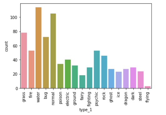
sb.countplot(data= df, x = 'type_1' )
plt.xticks(rotation = 90)
plt.show()
sb.countplot(data= df, x = 'type_1' )
plt.xticks(rotation = 90)
plt.show()결과
뒤집기
sb.countplot(data= df, y='type_1')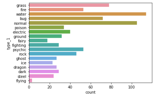
Bar Charts
불러오기
import numpy as np
import pandas as pd
import matplotlib.pyplot as plt
import seaborn as sb

%matplotlib inline

df = pd.read_csv('data/pokemon.csv')
df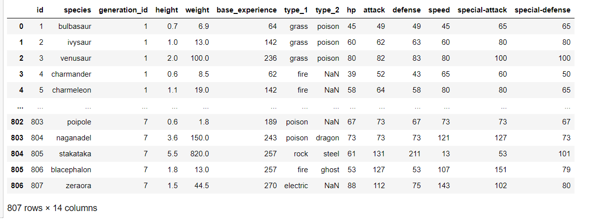
df['generation_id'].nunique()
7
df['generation_id'].unique()
array([1, 2, 3, 4, 5, 6, 7], dtype=int64)
df.shape
(807, 14)
df['generation_id'].value_counts()

5    156
1    151
3    135
4    107
2    100
7     86
6     72
Name: generation_id, dtype: int64
Pie Charts
# 퍼센테이지로 비교해서 보고 싶을때! 사용한다.
# 각 제너레이션 아이디별로, 파이차트를 그린다.

sorted_data = df['generation_id'].value_counts()
sorted_data

5    156
1    151
3    135
4    107
2    100
7     86
6     72
Name: generation_id, dtype: int64

plt.pie(sorted_data, autopct= '%1f', labels= sorted_data.index , startangle= 90, wedgeprops={'width':0.7})
plt.title('Generation id Pie Chart')
plt.legend()
plt.show()
히스토그램 - 해당 레인지의 갯수
# 구간을 설정하여, 해당 구간에 포함되는 데이터가 몇개인지 세는 차트를 히스토그램이라고 한다.
# 구간을, 전문용어로 bin이라고 부른다.
# bin이 여러개니까, bins라고 부른다.
# 히스토그램의 데이터는 동일하지만, 구간을 어떻게 나누냐에 따라서, 차트모양이 여러가지로 나온다.

df
df['speed'].describe()
count 807.000000
mean 65.830235
std 27.736838
min 5.000000
25% 45.000000
50% 65.000000
75% 85.000000
max 160.000000
Name: speed, dtype: float64
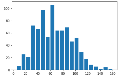
plt.hist(data= df, x = 'speed' , rwidth= 0.8)
plt.show()결과

# bin의 갯수를 변경하는 경우! 10개, 20개, 15개, 38개 .....
plt.hist(data= df, x = 'speed' , rwidth= 0.8, bins = 20)
plt.show()
결과
plt.hist(data= df, x = 'speed' , rwidth= 0.8, bins = 58)
plt.show()
결과

# bin의 범위를 변경하는 경우로, 특정 숫자로 범위를 지정한다.
# 스피드의 최소값과 최대값 사이를, 일정한 간격으로 나눠주는 방법
df['speed'].min()
5
df['speed'].max()
160
np.arange(5, 160+7, 7)
array([  5,  12,  19,  26,  33,  40,  47,  54,  61,  68,  75,  82,  89,
        96, 103, 110, 117, 124, 131, 138, 145, 152, 159, 166])

my_bins = np.arange(5, 160+7, 7)
my_bins

array([  5,  12,  19,  26,  33,  40,  47,  54,  61,  68,  75,  82,  89,
        96, 103, 110, 117, 124, 131, 138, 145, 152, 159, 166])

plt.hist(data= df , x = 'speed' , rwidth=0.8 , bins = my_bins)
plt.show()
결과

Figures, Axes and Subplots
# 하나에 여러개의 plot을 그린다.
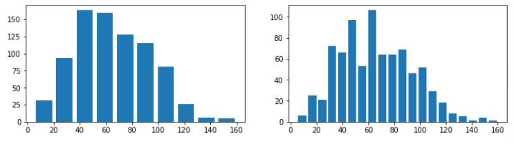
plt.figure(figsize = (12, 3))
plt.subplot(1, 2, 1) # 1행 2열의 첫번째 차트
plt.hist(data = df, x = 'speed', rwidth=0.8, bins = 10)
plt.subplot(1 , 2, 2) # 1행 2열의 두번째 차트
plt.hist(data = df, x = 'speed', rwidth=0.8, bins = 20)
plt.show()결과
Bivariate (여러개의 변수) Visualization 방법
Scatterplots
import numpy as np
import pandas as pd
import matplotlib.pyplot as plt
import seaborn as sb
%matplotlib inline

# 두 컬럼간의 관계를 차트로 나타내는 방법
# 관계란 ??
# 1. 비례관계 2, 반비례관계, 3. 아무관계없음 3가지를 말한다.

df = pd.read_csv('data/fuel_econ.csv')
# 1. plt의 scatter의 사용
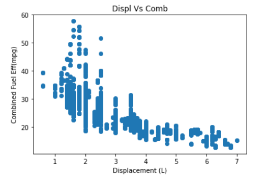
plt.scatter(data= df, x = 'displ' , y='comb')
plt.title('Displ Vs Comb')
plt.xlabel('Displacement (L)')
plt.ylabel('Combined Fuel Eff(mpg)')
plt.show()결과
df.shape
(3929, 20)
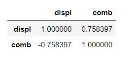
# 상관계수(상관분석, 상관관계분석)
df[['displ', 'comb']].corr()결과
#2. seabon의 regplot을 이용하는 방법

# reg의 뜻은?? regression(회귀) : 데이터에 fitting한다는 의미이다.

sb.regplot(data= df, x = 'displ' , y='comb')

plt.title('Displ Vs Comb')
plt.xlabel('Displacement (L)')
plt.ylabel('Combined Fuel Eff(mpg)')

plt.show()
결과

sb.pairplot(data= df, vars=['displ', 'comb'])
plt.show()
결과

Heat Maps : 밀도를 나타내는데 좋다.
df.shape
(3929, 20)

plt.hist2d(data= df, x = 'displ' , y = 'comb' , cmin= 0.5, cmap='viridis_r', bins=100) #cmin은 데이터없는부분을 없애준다.

plt.title('배기량과 연비관계')
plt.xlabel('Displacement (L)')
plt.ylabel('Combined Fuel Eff(mpg)')

plt.colorbar()
plt.show()
결과

한글 처리를 위해서는, 아래 코드를 실행하시면 됩니다.
import numpy as np
import pandas as pd
import matplotlib.pyplot as plt
import seaborn as sb

%matplotlib inline

import platform

from matplotlib import font_manager, rc
plt.rcParams['axes.unicode_minus'] = False

if platform.system() == 'Darwin':
    rc('font', family='AppleGothic')
elif platform.system() == 'Windows':
    path = "c:/Windows/Fonts/malgun.ttf"
    font_name = font_manager.FontProperties(fname=path).get_name()
    rc('font', family=font_name)
else:
    print('Unknown system... sorry~~~~')
문제 1. 위에서 city 와 highway 에서의 연비 관계를 분석하세요. (스케터 이용)
plt.scatter(data= df, x = 'city' , y='highway')

plt.title('도심과 고속도로의 연비관계')
plt.xlabel('city')
plt.ylabel('highway')

plt.savefig('chart1.jpg')
plt.show()
결과

df[['city','highway']].corr()결과

문제 2. 엔진 크기와 이산화탄소 배출량의 관계를 분석하세요. (히트맵으로) displ 이 엔진사이즈이고, co2 가 이산화탄소 배출량입니다. 트랜드를 분석하세요
plt.hist2d(data= df, x = 'displ' , y = 'co2' , cmin= 0.5, cmap='viridis_r', bins=20) #cmin은 데이터없는부분을 없애준다.

plt.title('엔진과 이산화탄소 배출량의 관계')
plt.xlabel('displ')
plt.ylabel('co2')

plt.colorbar()
plt.show()
'Python > Pandas' 카테고리의 다른 글
| Pandas : 대중교통 / 범죄현황 / seaborn / pairplot (0) | 2022.05.04 |
|---|---|
| Pandas : pivot_table / Dates and Times/Frequencies and Offsets (0) | 2022.05.04 |
| pandas : Google Map API(Geocoding API 설정방법) /csv file 불러오기 / encoding (0) | 2022.05.03 |
| pandas : 기온데이터분석 / 히스토그램 (0) | 2022.05.03 |
| pandas : Series/Label&Index/NaN (0) | 2022.04.28 |


