실습 1. 패키지 설치
프로젝트를 위해, 아나콘다 프롬프트를 실행하고, 다음을 인스톨 한다.
conda install -c conda-forge wordcloud
IMPORTING DATA
아래코드를 실행시킨다.
# import libraries
import pandas as pd
import numpy as np
import matplotlib.pyplot as plt
import seaborn as sb
%matplotlib inline
실습 2. pandas로 파일 읽기 - 탭으로 되어 있는 tsv 파일 읽기
df = pd.read_csv('data/amazon_alexa.tsv' , sep='\t')실습 3. verified_reviews 컬럼의 내용이 어떤지 확인해 보세요
df.loc[:, 'verified_reviews'][6]
실습 4. 피드백은 0과 1로 되어있습니다. 1은 긍정, 0은 부정입니다. 긍정 리뷰와 부정리뷰의 갯수를 그래프로 나타내세요.
X = df.head()
sb.countplot(data= df , x = 'feedback')
plt.show()
실습 5. rating 은 0 ~ 5로 되어있습니다. 유저의 별점(rationg) 별 리뷰갯수를 그래프로 나타내세요.
in
df.shapeout
(3150, 5)in
sb.countplot(data=df, x = 'rating')
plt.show()
out
my_order = df['rating'].value_counts().index

sb.countplot(data=df, x = 'rating', order=my_order)
plt.show()
out
WORD CLOUD 사용하여, 유저들이 어떤 단어를 많이 사용하였는지 시각화 해본다.
실습 1. 먼저 WORD CLOUD 를 이용하기 위해서, verified_reviews 를 하나의 문자열로 만들겠습니다.
실습 1-1. verified_reviews 를 하나의 리스트로 만듭니다.
review_list = df['verified_reviews'].to_list()
review_list
실습 1-2. 위의 words 리스트를, " " (공백) 으로 합쳐서, 하나의 문자열로 만듭니다.
reviews = ''.join(review_list)
reviews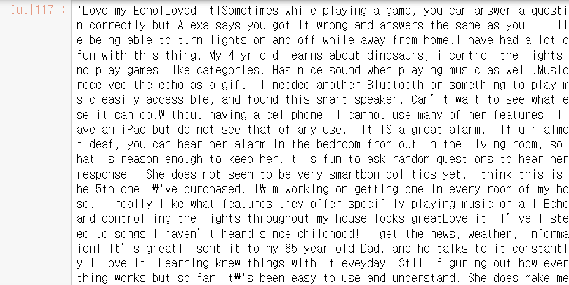
실습 2. WordCloud 를 이용하여, 화면에 많이 나온 단어들을 시각화 합니다.
from wordcloud import WordCloud, STOPWORDS### 불용어처리 ###
# 불용어란, 필요없는 단어를 불용어라고 한다.
# 필요없는 단어는, 상황에 따라 다르므로, 각 상황에 따른 불용어를 처리한다.
불용어를 처리하는 방법 : STOPWORDS 대문자로 실행. (아래의 OUT 경우는 'Alexa'를 삭제하고 Background를 White로 바꾸는 코드이다.
in
wc = WordCloud(background_color='white' , stopwords=my_stopwords)
my_stopwords = STOPWORDS
my_stopwords.add('Alexa')
wc.generate(reviews)
out
<wordcloud.wordcloud.WordCloud at 0x2374bc584c0>plt.imshow(wc)
plt.axis('off') # 좌표를 없애주는 파라미터.
plt.show()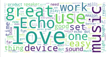
실습 3. Data Cleaning 과 Feature Engineering
in
from sklearn.feature_extraction.text import CountVectorizer
vec = CountVectorizer()
count_vec = vec.fit_transform( df['verified_reviews'] )
count_vec.shape
out
(3150, 4044)
in
count_vec.toarray() #sparse하다라고 표현함.
out
array([[0, 0, 0, ..., 0, 0, 0],
       [0, 0, 0, ..., 0, 0, 0],
       [0, 0, 0, ..., 0, 0, 0],
       ...,
       [0, 0, 0, ..., 0, 0, 0],
       [0, 0, 0, ..., 0, 0, 0],
       [0, 0, 0, ..., 0, 0, 0]], dtype=int64)
vec.get_feature_names()
len( vec.get_feature_names() )
### out
4044
review_array = count_vec.toarray()
review_array[ 0, ]
#####out
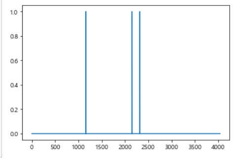
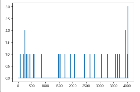
array([0, 0, 0, ..., 0, 0, 0], dtype=int64)차트만들기
in
plt.plot(review_array[0, ])
plt.show()
in
df['verified_reviews'][2]
out
'Sometimes while playing a game, you can answer a question correctly but Alexa says you got it wrong and answers the same as you. I like being able to turn lights on and off while away from home.'
in
plt.plot(review_array[2, ])
plt.show()
out
데이터 비주얼라이징 - 리뷰길이(글자수)와 별점의 관계를 히트맵으로 나타내세요.
df.head()
df.shape(3150, 5)
apply로 하는법 (첫번째방법)
df['verified_reviews'].apply( len )
.str 이용하는 방법 (두번째방법)
df['len'] = df['verified_reviews'].str.len()
sb.scatterplot(data= df, x='len', y='rating')
plt.show()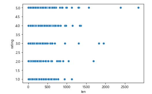
plt.hist2d(data= df, x='len', y='rating' , cmin=0.6, cmap='viridis_r')
plt.colorbar()
plt.show()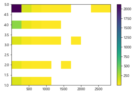
상관계수 구하기
df[['len','rating']].corr()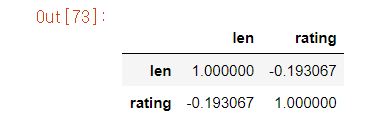
리뷰를 가장 길게 쓴 사람은 별점 몇점 줬을까?
in
df_min = df.loc[df['len']== df['len'].min() ,]
df_min['rating'].value_counts()
out
5 42
1 15
3 12
4 8
2 4
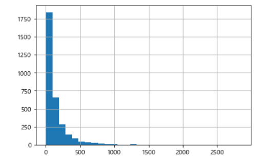
Name: rating, dtype: int64데이터 비주얼라이징 - 리뷰길이를 히스토그램으로 확인하세요.
import numpy as np
import pandas as pd
import matplotlib.pyplot as plt
import seaborn as sb

%matplotlib inline

import platform

from matplotlib import font_manager, rc
plt.rcParams['axes.unicode_minus'] = False

if platform.system() == 'Darwin':
    rc('font', family='AppleGothic')
elif platform.system() == 'Windows':
    path = "c:/Windows/Fonts/malgun.ttf"
    font_name = font_manager.FontProperties(fname=path).get_name()
    rc('font', family=font_name)
else:
    print('Unknown system... sorry~~~~')


    df['len'].hist(bins=30)
plt.show()